Company

25 Jun 2026
Gruppo Mastrotto donates a new vehicle for the transport of people with disabilities to the Croce Rossa Italiana – Vicenza Committee, in memory of Mr Bruno
.
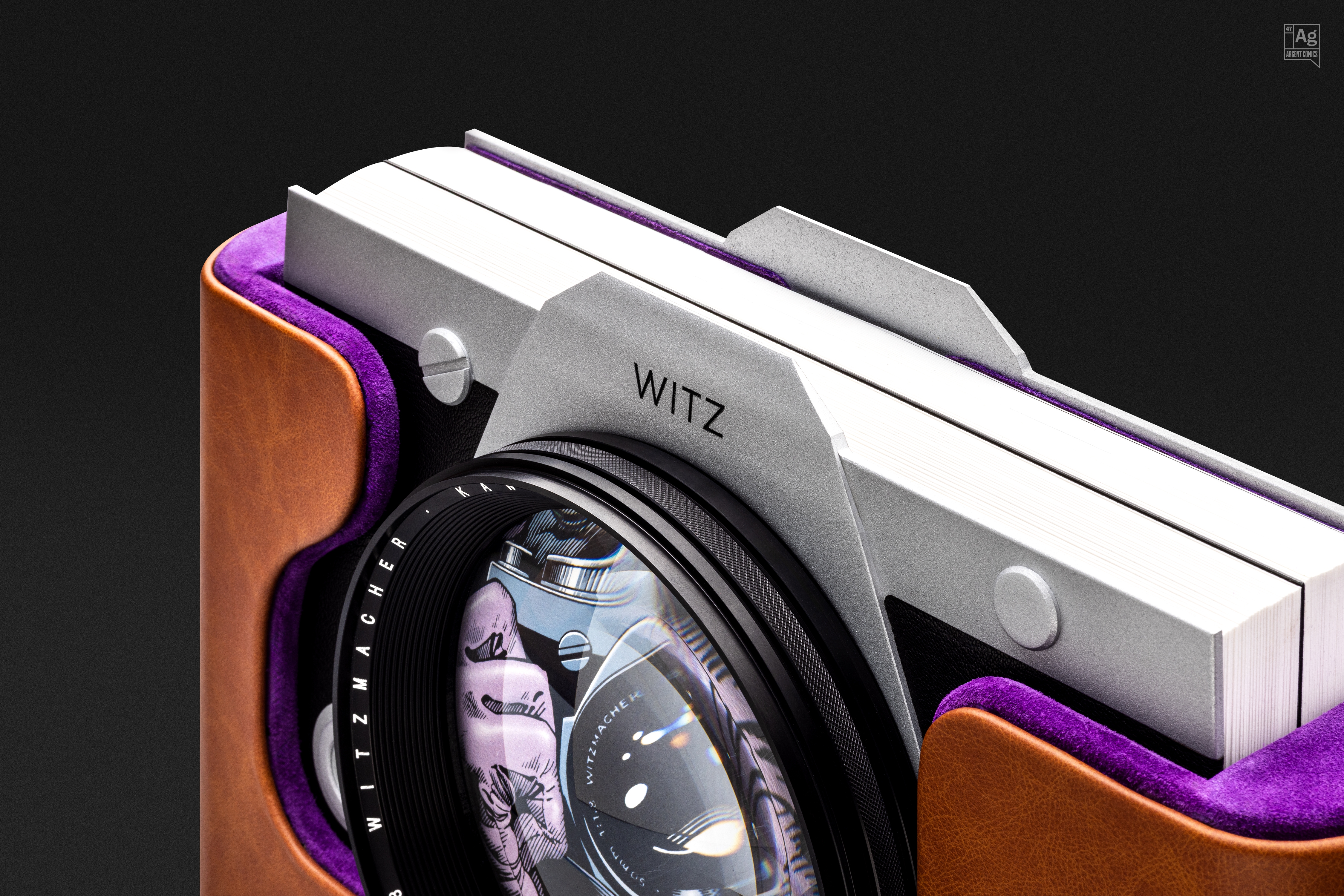
In high-end publishing, the support is never neutral. There are projects in which the choice of materials is not the final stage of production, but the very pulse of the creative idea itself. This is the case of BTKJ Avant-Garde Edition, the ambitious reinterpretation of Alan Moore and Brian Bolland’s masterpiece, Batman: The Killing Joke, curated by the Argent Comics collective.
Limited to only 47 numbered copies, this edition was not conceived as a simple collector’s reprint, but as a fine art editorial object that challenges the boundaries between design and visual culture. Within this context of excellence, Gruppo Mastrotto leather was chosen to play a central role: not merely as a covering, but as an integral part of the object’s tactile and visual experience.
Beyond the Cover: Leather as Protection and Identity
In a work where every detail is pushed to the highest level, from giclée printing on metallic paper to the milled aluminium structure replicating the Joker’s camera, leather strengthens the physical presence of the volume and reinforces its exclusive character.
The case, conceived as an artisanal lens bag, uses leather to fulfil a threefold function: protecting the preciousness of the content, elevating its aesthetic value and contributing decisively to the final identity of the object. Here, the craftsmanship of hand-stitching meets the precision of industrial design, creating a coherent point of contact between publishing and material culture.
A Chromatic Dialogue Between Surface and Madness
The true strength of this design choice lies in the direct dialogue between story and surface. The creators identified Gruppo Mastrotto’s Mistral and Vesuvio articles as the ideal materials to evoke the visual universe of the Joker.
The chromatic combination is not merely an aesthetic decision, but a visceral reference to the character’s symbolic colours: purple and green. Through the grain and depth of these leathers, the chromatic contrast becomes a tactile sensation, allowing the collector to “touch” the atmosphere of the work even before opening it. It demonstrates how a material, when integrated into the project from the very beginning, can become a narrative vehicle.
Transversality and Perceived Value: The Future of Leather
For Gruppo Mastrotto, the use of its leathers in a work of this scale represents a concrete example of how leather can move beyond the boundaries of traditional sectors. While fashion, interior design and automotive remain fundamental markets, projects such as the Avant-Garde Edition show the material’s ability to enter more transversal fields: auteur publishing, niche design and cultural projects with high perceived value.
Seeing our articles selected for an edition that aims to redefine the history of contemporary comics confirms a clear vision: the quality of the raw material is the foundation on which design innovation is built. When technique meets emotion, leather ceases to be an accessory and becomes architecture, memory and, ultimately, art.
Green and Purple: The Colour Psychology Behind the Joker’s Madness
It is no coincidence that our Mistral and Vesuvio articles were selected in these specific tones. In the history of comics, there is an unwritten yet persistent chromatic convention: while heroes are often defined by primary colours (blue, red and yellow) to communicate stability, courage and purity, great antagonists are frequently associated with secondary colours.
Green and purple are symbols of chromatic deviation. As “derived” rather than pure colours, they visually convey a sense of ambiguity and psychological otherness. Through the grain and depth of the material, this ancestral contrast between order, represented by primary colours, and chaos, represented by secondary colours, stops being merely visual and becomes an immediate tactile sensation: the collector physically encounters the essence of the character even before turning the first page.